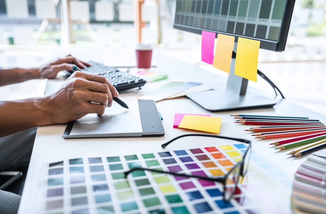
Every strong photograph starts long before the shutter clicks. It starts with a vision, and the best way to shape that vision is with a well-built mood board. In this practical walkthrough, I’ll show you exactly how to create a mood board for photography that actually guides your shoot, using free tools I rely on every week: Pinterest and Milanote. You’ll also see real examples from portrait and editorial projects I’ve shot at the studio.
What Is a Photography Mood Board (and Why It Matters)
A photography mood board is a curated collection of visual references that defines the aesthetic, mood, lighting, colour palette, styling and composition of a shoot before you even pick up your camera. It’s the visual brief that keeps you, your client, your stylist, your MUA and your assistants aligned.
Without one, shoots drift. With one, everyone on set understands the destination.
The Three Core Components of a Strong Mood Board
- Visual references (photos, film stills, paintings, textures)
- Aesthetic descriptors (colour palette, lighting notes, keywords)
- Practical direction (poses, wardrobe, locations, props)
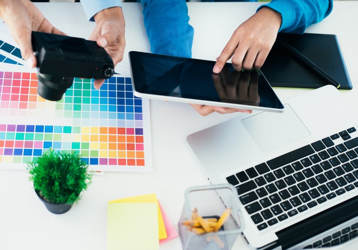
Step 1: Define the Concept Before Collecting Images
This is the step most photographers skip, and it’s why their mood boards end up as random pretty pictures. Before opening Pinterest, write down 3 to 5 keywords that describe the shoot.
Real example from a recent editorial shoot I did for a Parisian eyewear brand:
- Warm 1970s cinema
- Golden hour, low sun
- Soft grain, muted contrast
- Confident, quiet, introspective
- Terracotta and cream palette
Those five lines shaped every image I pinned afterwards.
Step 2: Gather References on Pinterest
Pinterest is my go-to for discovery because its algorithm surfaces adjacent visuals you wouldn’t have searched for.
- Create a secret board (so clients don’t see the messy first draft).
- Search using specific terms: instead of “portrait”, try “window light portrait film grain 35mm”.
- Pin freely for 20 to 30 minutes without judging. Aim for 40 to 60 images.
- Walk away for a few hours. Come back and ruthlessly cut down to 15 to 25 keepers.
Pro tip: Right-click and save your favourites locally too. Pinterest links break, and clients love losing access to shared boards the day before the shoot.
Search Terms That Actually Work
| Shoot Type | Effective Pinterest Search |
|---|---|
| Editorial fashion | “editorial fashion film grain muted tones” |
| Corporate portrait | “environmental portrait natural light office” |
| Beauty close-up | “beauty macro skin texture soft box” |
| Product / still life | “still life hard light shadow play editorial” |
Step 3: Organize Themes in Milanote
Pinterest is great for collecting. It’s terrible for structuring. This is where Milanote takes over. The free plan is enough for most shoots (up to 100 elements per board).
I split every mood board into clear zones:
- Overall vibe (3 to 5 hero references)
- Lighting direction (side light, backlight, mixed sources)
- Colour palette (a swatch strip pulled from the hero images)
- Posing and expression
- Wardrobe and styling
- Location or set design
- Post-production reference (grade, grain, contrast)
Each zone gets its own labelled column. When I open the board on set on an iPad, I can jump straight to “Lighting” while the assistant is setting up.
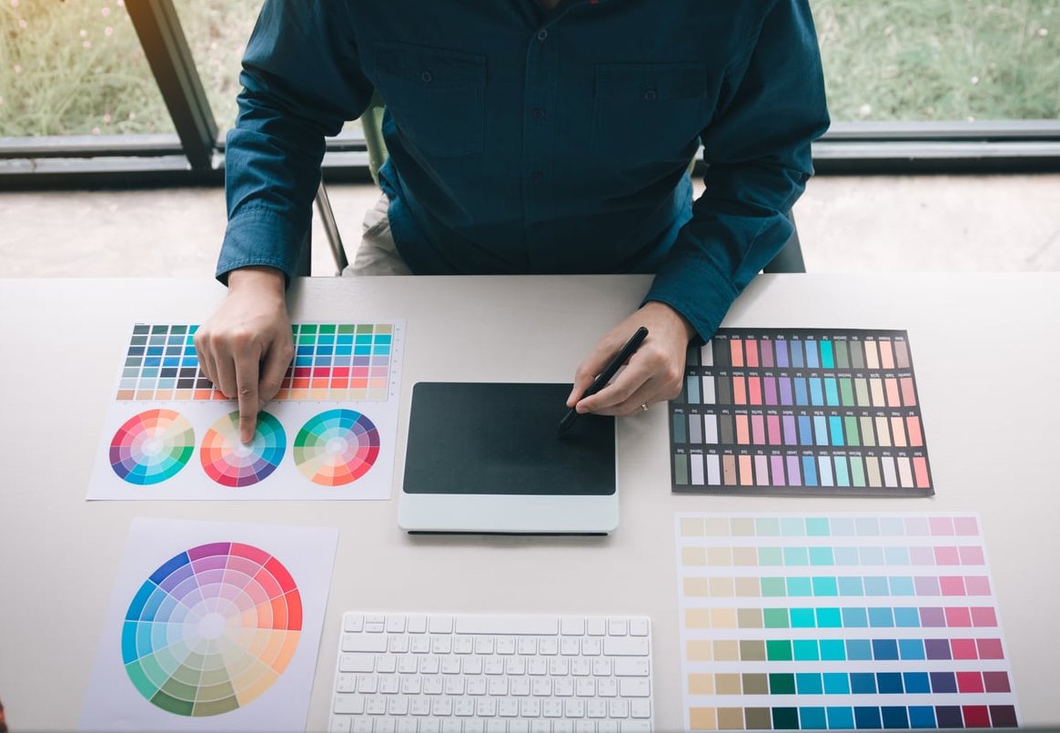
Step 4: Build the Colour Palette
Colour is what unifies a mood board and, later, the final edit. Once your references are chosen, pull 5 to 7 dominant tones.
Free tools I use:
- Coolors.co (upload an image, extract palette instantly)
- Adobe Color (extract from images, check harmony rules)
Drop the swatches directly into your Milanote board. This palette becomes the north star for wardrobe choices, set dressing and the final colour grade in Capture One or Lightroom.
Step 5: Add Written Direction
A mood board without words is open to interpretation, and interpretation kills client shoots. Next to your visuals, add short notes like:
- “Backlight from window, no reflector, embrace shadow on the face”
- “Slight over-expose, lift shadows in post, keep grain heavy”
- “Wardrobe: cream, camel, rust. No black, no cool tones”
These notes turn your mood board from inspiration into a real production tool.
Step 6: Share, Refine, Approve
Send the Milanote board to your client with view-only access. Ask for feedback on three specific points: vibe, lighting, and colour. Vague questions get vague answers.
Refine once, maximum twice. If a client wants a third round of revisions, the concept isn’t clear yet, go back to Step 1.
Real Example: Editorial Portrait Shoot
For a recent editorial cover project, my final mood board contained:
- 18 reference images (down from 74 pinned)
- A 6-colour palette pulled from three film stills
- 4 lighting diagrams sketched in Milanote
- 2 wardrobe reference rows
- 1 paragraph describing the emotional tone
Total build time: about 90 minutes. Time saved on set arguing about direction: several hours.
How Many Images Should a Mood Board Contain?
Between 15 and 25 references is the sweet spot. Fewer than 10 and the direction feels thin. More than 30 and the vision becomes diluted. Every image should earn its place.
Common Mood Board Mistakes to Avoid
- Copying instead of referencing. A mood board defines mood, not a shot list you clone frame-by-frame.
- Mixing contradictory aesthetics. Warm cinematic and cold clinical don’t cohabit well.
- Skipping the colour palette. It’s the single most useful section on set.
- Forgetting to share it with the whole team, including the MUA and stylist.
Pinterest vs Milanote vs Canva: Which Should You Use?
| Tool | Best For | Weakness |
|---|---|---|
| Discovery and gathering | No real structure, links break | |
| Milanote | Organizing, sharing with clients | Free plan has element limits |
| Canva | Polished PDF export for clients | Less flexible for creative sprawl |
My personal workflow in 2026: Pinterest to collect, Milanote to structure, Canva to export a clean PDF if the client needs something printable.
Frequently Asked Questions
What are the three main components of a photography mood board?
Visual references (images and textures), aesthetic descriptors (colour palette, keywords, lighting notes) and practical shoot direction (wardrobe, poses, locations).
How many photos should a mood board contain?
Aim for 15 to 25 curated images. Fewer feels thin, more becomes noise.
Can I create a mood board for photography for free?
Yes. Pinterest, Milanote (free plan), Coolors and Canva together cover the entire process at zero cost.
Should I show the mood board to the model or subject?
Absolutely. Sharing 3 to 5 key references with your subject before the shoot dramatically improves posing and expression on the day.
How long should it take to build a mood board?
For a defined project, budget 60 to 120 minutes. Anything longer usually means the initial concept wasn’t clear enough.
Do I need a mood board for personal projects too?
Yes, arguably even more. Personal projects have no client to keep you on track, so your mood board becomes the discipline that stops you from drifting.
Want to see how these principles translate into real editorial and portrait work? Explore my portfolio on jackharrisphoto.com or get in touch to discuss your next shoot.